A colophon: how this site is made
A lab that studies measurement should be able to show its own working. This note documents the site you are reading: two colours and their arithmetic, a book face driven by its optical axis, and images that are printed, not styled.
Two colours, measured
The palette is one hue of green, called pine, and one warm paper, plus an ink for text. Everything else on the site is a mix of those, there is no token a third colour could live in. The important property is symmetry: pine on paper and paper on pine both measure 8.69:1, which clears WCAG AAA in either direction.1 That symmetry is what allows inversion, a panel that flips to paper on pine, to serve as the site's only form of emphasis.
| Pair | Ratio | Grade |
|---|---|---|
| ink on paper | 14.46:1 | AAA |
| pine on paper | 8.69:1 | AAA |
| paper on pine | 8.69:1 | AAA |
| muted ink on paper | 5.24:1 | AA |
| muted paper on pine | 5.13:1 | AA |
These numbers are not copied into the style guide, they are computed there at render time from the live tokens. If a token drifts, its grade drifts with it, in public, on the style page.
Measured, not asserted. The rule applies to the site the same way it applies to the research.
House ruleA book face, on its optical axis
The text face is Literata, a serif designed for long-form reading, with an optical size axis running from footnote to title page. The site never sets it above weight 400. Emphasis at display sizes comes from the axis instead: large settings take a high optical size, where the serifs thin and the stroke contrast rises, which is the serif equivalent of dropping to a light weight. Labels, dates, captions and figure numbers are IBM Plex Mono, uppercase and letterspaced, used the way a book uses marginalia: punctuation, not furniture.
Printing with errors
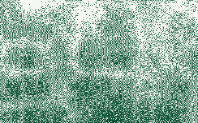
Every image on this site is a two-colour print produced by Floyd–Steinberg error diffusion: each pixel is quantised to pine or paper, and the quantisation error is pushed onto neighbours that have not yet been visited.2 The scan alternates direction on each row to break up the diagonal artefacts plain diffusion produces on flat gradients.
right       7/16
down-left   3/16
down        5/16
down-right  1/16   — the kernel, mirrored on right-to-left rows
The sources are not photographs. They are procedural luminance fields, ridged noise for terrain, warped bands for drapery, shells for a scan sweep, generated from fixed seeds so the same page renders the same pixels on every visit.3
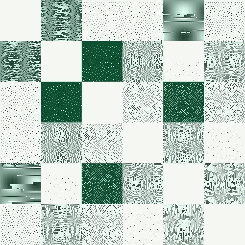
The same pipeline can print data instead of decoration. The figure below is this site's own contrast matrix, every token pair's measured ratio rendered as tone, darker meaning higher contrast. The bright band is the paper row sitting next to everything dark; the diagonal is each colour against itself at 1:1.
What this site does not do
It sets no cookies and carries no advertising tags. It runs a small, first-party InsightFlare script for traffic and performance measurement; persistent browser identifiers are disabled for EU visitors and Do Not Track is honoured. It does not animate beyond an 80ms colour transition. It has no third colour: even form errors are marked with a pine rule rather than a red one. The absence is the point. A site from a safety lab should be legible about exactly what it is doing, and this one is doing very little, on purpose.
- Contrast ratios follow the WCAG 2.x relative luminance definition. ↩
- Floyd, R. W., and Steinberg, L., "An adaptive algorithm for spatial greyscale," 1976. The implementation here is ported from the rendering pipeline of specula, the lab's scanning control plane, which is not yet public. ↩
- Seeding uses mulberry32, a small PRNG that is fast and good enough for texture, which is all that is asked of it. ↩